 |
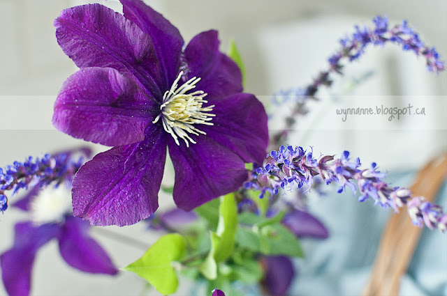
| Clematis and salvia from our garden. I'm seriously contemplating having this picture printed to hang in the dining room. |
Before I show you the after, let me refresh your memory with a couple of 'before' pictures.
These pictures show what our kitchen came with when we bought it.
It was pretty, and modern-looking, but far from functional.
As soon as we moved in, we rushed to install more cabinets. Using the area that had been set aside for an eating area, we used every linear inch of available wall space for cabinets.
 |
| Having the food prep area on the opposite side of the kitchen from the sink and stove proved to be incredibly frustrating. |
After living with this for five years, we decided that a kitchen renovation would be our first retirement project. We started in January. The bulk of the work was done by March, but we've dragged our heels and have finally finished the job. Here is the (approximate) new layout. (IKEA changed its planning software and I can no longer load the floor plan to make updates for changes we made along the way.)
| Wall A is now wide open to the dining room. The sink and stove are now in a convenient work corner. |
And now, without further ado**, I present . . . . THE KITCHEN!
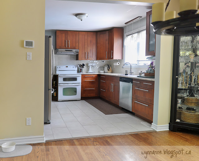
This is the view of the kitchen from the dining room. I've moved the dining table to the right and behind me, in order to get a better picture. That corner between the sink and stove is just about perfect. And the counter to the right of the sink/dishwasher means that a second person can help with meal prep like chopping vegetables. The other night, we actually had three people working in the kitchen:
- I prepared a green salad
- Steve prepared a potato salad
- Katie husked corn
Moving a little to the right (still in the dining room), this is the view through the kitchen to the back hall.
 |
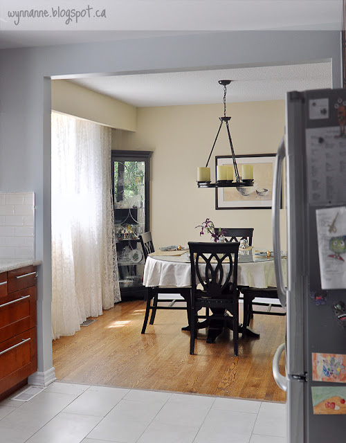
| View of the dining room |
 |
| The pantry wall, viewed from the sink (That fire extinguisher is now mounted on the wall above the tile, beside the microwave.) |
 |
| The kitchen as you enter from the front hall |
FAVOURITE THINGS
The overall layout of the room is my hands-down favourite thing about the new kitchen; it works. I'm no longer frustrated trying to find a place to rest my ingredients or having to jockey things from one side of the kitchen to the other.
Still looking at that last picture, I'm really happy with how the countertop, floor, and subway tile work together: the space is bright but not sterile. The slightly grey floor tile does not look dingey. I also love the paint colour we chose. When we first painted, it felt a little too turquoise, but it has settled to a soft, warm blue-grey.
Now, let me show a few of my favourite little bits.
 |
| That's my turkey-roaster in the sink, for demonstration purposes. |
This sink. I love this sink. We used to have a two-bowl sink, each basin of the same size. It meant that I could never fit any large pans right in the sink to soak. This was especially annoying with roasting pans.
 |
| Boholmen collander, $7 |
I use this colander as a drainer, and it effectively functions as the second basin. We use it to drain our rinse-and-reuse French press, as well as other items. For example, I can rinse lettuce and leave it there if there are other items soaking in the sink.
The new faucet is more durable than our previous one, which had cracked. It also has a little 'pause' button on the pullout, so I can temporarily stop the flow while I move the nozzle over the counter to a pot nearby. (It does not reach all the way to the stove.) The faucet handle is a little silly, but I can live with it.
Although we had considered having 'drainage' grooves cut into the granite, the cost proved to be prohibitive, so we settled for this little microfibre mat, which works very well. A $20 purchase instead of a $1,500 feature seems like an excellent trade-off to me!
This cheap little IKEA pull-out under the sink houses our dish cloths and tea towels. We want to get more of these drawers, but they haven't been available for months.
 |
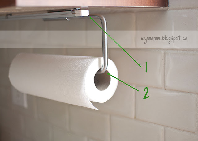
| 1. LED lights 2. hanging paper-towel holder |
Getting the paper towel off the counter was also a blessing.
 |
| IKEA's Lamplig cutting board, $20 |
I love the subway tile we finally chose, but I'm glad we had somewhere to put a couple of panels of the accent tile.
 |
| A small microwave |
Now that the microwave/vent combination is gone, we have an efficient -- and quiet -- vent hood over the stove. It is so quiet that, unless it's on its highest power setting, you barely even know it's on.
 |
| My dry-goods jars |
 |
| Cookbooks, rice, oil and vinegar (as well as a couple of other things) |
So there you have it. I love this space so much that when I was browsing real estate listings (as one does), I groaned at all the houses in our price range because I would have had to completely redo every single kitchen.
Stephen's goal has been achieved: we're in this house for the long haul.
** Please note the correct use of 'ado' (not adieu).


Looks really great! So efficient and open! Love the cutting board :)
ReplyDeleteThanks! The cutting board was an inexpensive, but very functional find.
DeleteWow, so much to love! The extras that caught my eye are the drainer, love the cutting board, and I 'need' the IKEA tea towel storage. I really like the way you utilized your space, and that 3 people can function at once with space demanding tasks is impressive. Great job!!
ReplyDeleteThank you, Sheila. It's a happy space now!
DeleteI love it!!! it looks just fabulous - so light and airy, and like you say even though there is white and the subway tiles, it does not feel sterile at all. And those little handmade shelves are amazing.
ReplyDeleteI really like the blue colour you used too.
so nice to see it all come together so beautifully.
Thank you. I agree: all-white and with subway tiles can often look sterile. As much as I admire those all-white kitchens (or other rooms), I often think the first thing I would do is paint. Or add curtains or something.
Delete